Tools To Design Android App Icon
App icons are small in size but make huge contribution to your app's success. Increasing downloads, advertising your app's look/style and communicating your app's function are only a few tasks an app icon can accomplish. That's a lot of power, and we want you to take full advantage! Therefore we've created this convenient guide that contains everything you need to know about designing app icons:
- What is an app icon?
- In the app store
- Knowing current design standards
- Showcasing your app's look and feel
- Communicating your app's function
- Getting an app icon designed
- Knowing your platforms
- Size and format
What is an app icon?
—
First things first, an app icon is not a logo. It pretty much does the same thing, right? Well… kind of.
While a logo identifies and represent a company's product or brand, an app icon identifies and represents, you guessed it, a company's (or individual's) application.

Think of app icons as a small container of a fixed size which holds a "bite-sized" piece of visual information about your application. Yes, of course you could put your product or brand's logo inside of an app icon if you want, but that doesn't make your app icon a logo (and for user experience it isn't likely the best solution).
Think about it this way: logos themselves are free to roam beyond the constraints of an app icon. They are scalable and can exist in any context: on flyers, websites, business cards, you name it (even in app icons). But forget logos! Let's talk app icons.
In the app store
—
As you probably know, the more attractive your app icon is, the more downloads and installs your app will get. With that said, attractive for one person might not be attractive to another person. Therefore it's not just about making a flashy icon that conquers all. Rather, it's about finding what looks attractive to your target audience. It is necessary to think about what style of app icon looks attractive to a coupon shopper, sports fan or gamer. Let's break it down!
Take for example the search result for "camera" in the Google Play store. Based on the resulting app icons, can you guess which camera app has the most installs? Golden Camera comes in last with an estimated 10 to 50 thousand installs, Professional HD Camera has an estimated 1 to 5 million installs, both Open Camera and Camera MX have an estimated 10 to 50 million installs, and in first place Candy Camera has an estimated 100 to 500 million installs.
Given that the Candy Camera app icon raked in the most installs, we can use it to learn about the general interests of camera app users. The design is colorful and playful, yet also portrays simplicity and functionality. The app icons for Open Camera and Camera MX also portray simplicity (which may explain their competitiveness in the app store), but their lack of color and playfulness may explain their lower install estimates. The takeaway here is that the target demographic for camera apps are largely seeking an app that is simple but fun.
We can look at this example from another angle as well. Candy Camera uses a design that closely follows Google's Material Design guidelines (we'll get into this in the next section). Basically Candy Camera is the only icon on this list that is following current design standards. Golden Camera and Open Camera look as though they were designed back when flat design and skeuomorphic design first came about. Today, these looks feel dated. Therefore it's also important to follow current design standards.
As fascinating as it is to dive into the design mechanisms in the examples above, the big takeaway here is that app icons clearly make a huge difference when it comes to downloads and installs.
Knowing current design standards
—
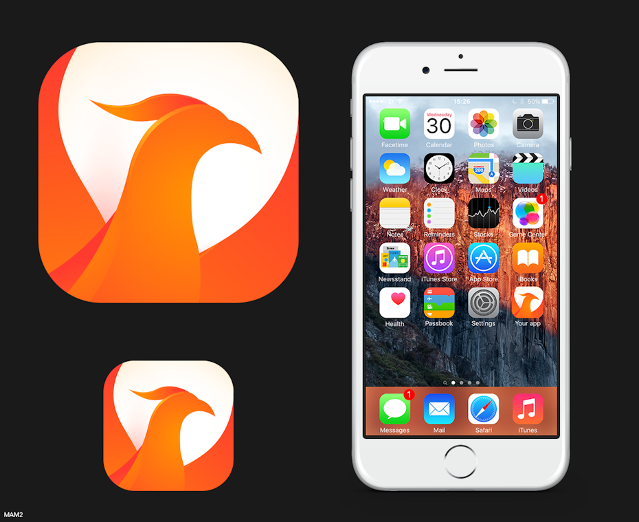
While you don't necessarily have to follow any rules aside from the submission size, both Google and Apple have created guidelines for how they want your app to look—and it's a good idea to follow them. As we observed above, app icons which follow these guidelines feel cohesive and relevant with regard to current trends. As a result, the respective apps generally receive more downloads.
With the most recent Android release, Google has implemented a new design language called Material Design, which is essentially an extensive set of guidelines for creating a cohesive visual interface—more specifically creating an experience that feels like you are interacting with pseudo-physical "materials" (despite it all being pixels). For designers who like the idea of contributing to this cohesive look and feel, Google has released thorough documentation on Material Design. For the Material Design icon guidelines, click here.
Apple has put forth similar guidelines for iOS called the Human Interface Guidelines. These guidelines are handy for iOS designers however they are not nearly as in depth as those for Material Design. With that said, it's not a bad place to start if you aren't sure what your iOS icon should look like. To check out the Human Interface Guidelines for iOS icons, click here.
Showcasing your app's look and feel
—

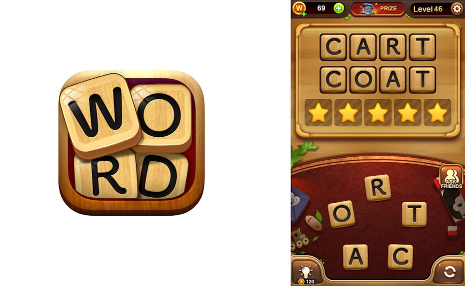
Naturally, your app icon should reflect the look and feel of your app – users want to know what to expect heading in. To use an analogy, how would you feel if you bought a gallon of "eggshell white" paint for your house, only to open it up and find that the paint was a deep brown color. Even though some eggshells are in fact brown, it's important to think about what consumers will be expect based on your branding.
To apply this to app icon design: If your app is design is flat, your icon should also be flat. If your app contains skeuomorphism, your icon should also have at least some element of skeuomorphism. If your app design follows Google's guidelines on Material Design, your app icon should too. Check out how the app icons in the examples above match the look and feel of their respective apps.
Communicating your app's function
—
App icons also play a role in the experience of the app as a whole. Take for example utility applications, such as calculators, "flashlights" or weather apps. These app icons should make the user feel like they have the utility at their fingertips. Think about what it feels like to pick up a pencil, to look at a thermometer or to measure something with a ruler – that is the feeling that a utility app's icon should inspire in the user. In the examples above, notice how you can almost feel the calculator buttons underneath your fingertips, or how the flashlight feels like it can be easily switched on and off with a slider switch.
Beyond inspiring this sense of utility, the icon examples featured above are instantly recognizable as utilities. One way designers accomplish this is by incorporating visual cues from popular cultural utilities. A great example is the retro-digital numbers used in the clock app icon above. Who doesn't remember or recognize those?
Another large category of apps is games. Unlike app icons for utilities, icons for games should draw the user into the world of that game. Simply put, game app icons should make you want to play! In the examples above, the attractive, glistening bowling ball smashing through pins is hard to ignore—it communicates action, movement, excitement and fun! Likewise, the Poké Ball resting on a planet under the stars teases you into a world that is hard not to want to explore.
It's also important to think about how these icons grab your attention. In the case of any bowling app, you want to showcase the action of bowling rather than showing stationary bowling pins: how boring! The same applies to Fruit Ninja Classic, where the action of slicing a fruit is shown in a flashy and exciting manner.
Getting an app icon designed
—
If you've already chosen a freelance designer for your app's UI design, it's not a bad idea to contract them specifically to create a matching app icon to maintain visual cohesion throughout your app. Alternatively, to see a wide range of app icon design ideas, holding a contest on 99designs is a good move.
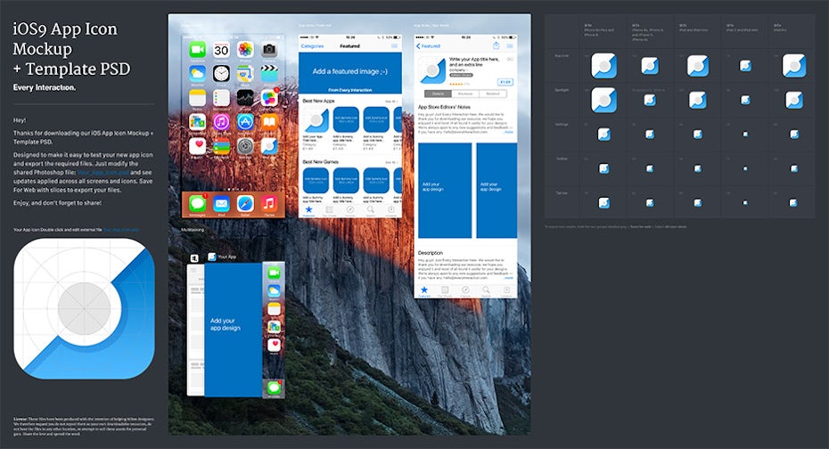
If you're looking for a starting point into designing your own icon say no more! Common design program choices for app icon design are Photoshop, Illustrator and Sketch. Generally speaking, use Photoshop if you are aiming to create raster effects (shadows, glares, reflections), use Illustrator if you are creating complex vector shapes, and use Sketch if you prefer built in app templates (Sketch comes with free app icon templates installed). For indepth reviews of these program and more, click here.
Knowing your platforms
—
Before we get into any specifics of app icon design, it's important to learn that there are two major camps of app icons: Android and iOS. While both types of app icons are (for all intensive purposes) a small square button that you press, there are important differences in size, and even in recommended style (more on that in our rules section). Let's get into it!
What size and format should my icon be?
—
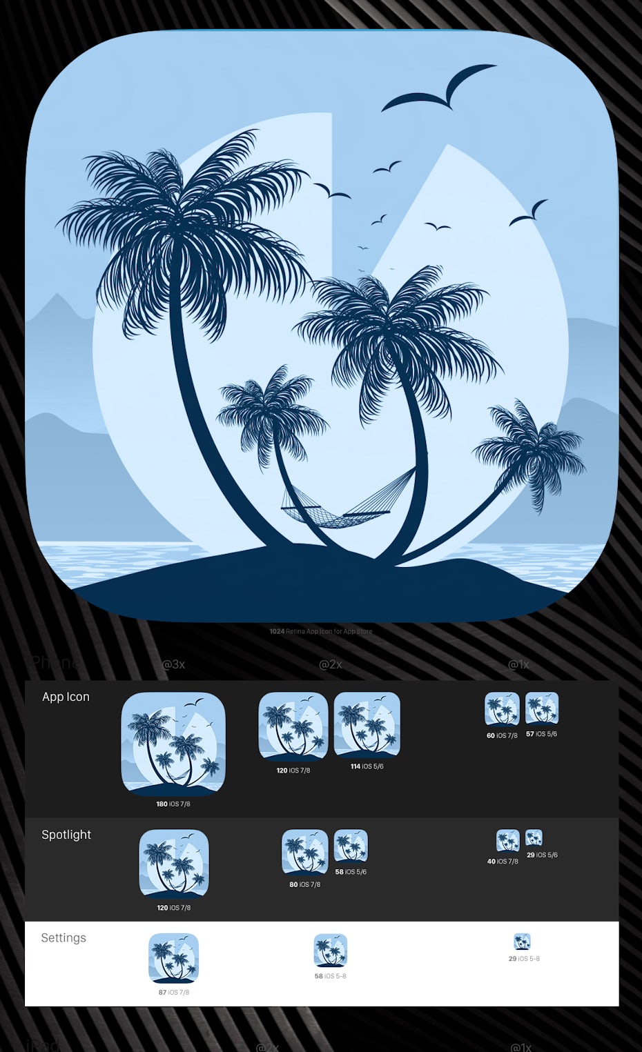
On Android devices, launcher icons are generally 96×96, 72×72, 48×48, or 36×36 pixels (depending on the device), however Android recommends your starting artboard size should be 864×864 pixels to allow for easier tweaking. Further, Android app designers will typically save a different size app icon for each generalized device screen density and store them in a density-specific resource directory within the application. For more info on that click here. Android app icons must be saved as PNG files.
As for iOS, app icons should be sized at 1024×1024 pixels. Similar to Android, the icon will be resized depending on the device and context, but Apple takes care of that for you. If you want the specifics on those sizes for visual testing or experimenting, click here. iOS app icons must be saved as PNG files.
Rock your app icon design
—
We know you have an awesome app idea—so don't get lost in the shuffle with a bad app icon design. Sticking to this guide will set you up with a design that looks amazing and reaches your target audience. You didn't think we'd let you eat your cake too?
App icon design resources
—
- Icon Templates Pack for Android 4.0 (Template pack direct from Android)
- Freebies Material icon template
- Every Interaction iOS app icon template
- Savvy Apps iOS app icon template
Ready to get an icon for your app?
Learn how you can get app icon ideas from graphic designers all over the world.
Tools To Design Android App Icon
Source: https://99designs.com/blog/web-digital/how-to-design-app-icons/
Posted by: edwardshimpat.blogspot.com

0 Response to "Tools To Design Android App Icon"
Post a Comment